


How it Works:
The game of Golf works on a point system. Much like the sport, the
goal is to end the game with the lowest overall score. Throughout the game, players try to either eliminate some of their cards or replace them with lower point cards. Each player starts with most of their cards facing down and the game is over once any player has all cards facing up.
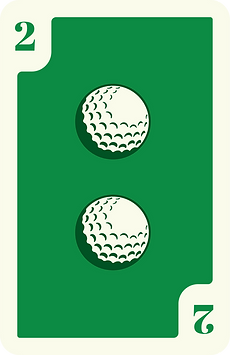
Each card has a unique point value, with the number cards being equal to that number of points and the face cards being equal to varying amounts of points.


Primary Font
BERGEN SANS BOLD
ABCDEFGHIJKLMNOPQRSTUVWXYZ
abcdefghijklmnopqrstuvwxyz
Secondary Font
BERGEN SANS REGULAR
ABCDEFGHIJKLMNOPQRSTUVWXYZ
abcdefghijklmnopqrstuvwxyz
The Cards:
Lots of card games come with decks that are designed specifically for them. This gets the players into the right mindset to play and ensures the cards are best suited to the intended game. So why is it so hard to find a purpose-built Golf set?
This set solves that problem.
Two issues with using generic cards are that players (especially new players) can forget which point values are assigned to which face cards when using a standard set of playing cards and that it can be hard for players to distinguish other players' face-up cards from a distance. The cards in this Golf set avoid these issues by forgoing suits or traditional characters such as K, Q, J, or A. Instead, each number card prominently features the number in the center while the would-be face cards feature golf-themed illustrations and prominent point values in the corners.
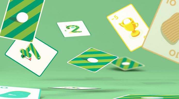

(Joker)
(Jack/Queen)
(Jack/Queen)
The Instructions:
Through some initial research, it became clear that most existing Golf players are only familiar with one version of the game and, since Golf can be played in multiple ways (4, 6, 8, 9, or 10 cards per player), it was important to design matching instruction sets for each version. This ensured that new players could properly grasp the game and that existing players could try versions of the game that they weren't already familiar with.


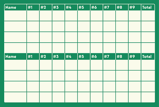
The Scorecards:
In keeping with the prevalent Golf theme, each scorecard has space for scoring either 9 or 18 rounds ("holes") and is designed to appear similar to a real life golf scorecard. This was done to keep the design on brand while also being a relatively standard game scorecard layout that players will know.


The Packaging:
We wanted to ensure that the product was as compact as possible, could work standing or hanging, and accurately represented the product. It was also important to emphasize that Golf can be played five different ways, with instructions for each being included.
The packaging is constructed of matte 310g card stock and utilizes 14 CMYK colors.


The Tuckboxes:
There are two tuckboxes in the set, each including 54 cards. They utilize the same look as the card backs and include the same callouts as the outer packaging. They also include that oh-so common golf callout: "Fore!", on the indent where players will open them.
The tuckboxes are constructed of matte 250g card stock and utilize 9 CMYK colors.


The Process:
These quick sketches were some ideas I was provided at the outset of the project. You'll notice that the final design sticks to them to varying degrees. When originally discussing the project with the art director and marketing team, we had the idea of making each card either have unique golf illustrations to represent their point values or have multiple golf balls to represent the given amount of points.


Here are some rough examples of the card design styles I explored. I found that, among other issues, each design ultimately placed the most important part (the numbers) as a bit of an afterthought.


-
Too stereotypical
-
Same layout as standard cards
-
Doesn't highlight the numbers
-
Doesn't highlight the numbers
-
Which illustrations would represent which numbers?
-
Doesn't highlight the numbers
-
A bit bland
This was the general direction that I initially explored for the front of the outer packaging. It's much more of a retro style than the final product and therefore, as with the cards, was a bit too plain and stereotypical to have the digital and physical shelf presence we were looking for.

The Inspiration:
Since the above concepts weren't quite looking right, I took a step back and thought of how to best emphasize the most important element: the numbers on the cards. I then realized that, since they didn't need traditional suits taking up the center or the numbers in the corner to remain visible while being held in hand, the numbers could take center stage.
The new issue was how to make that visually interesting. A flat number on a card isn't exactly the most thrilling of designs (sorry Uno).
In my exploration of how to add some depth, while a avoiding textured, retro design, I was reminded of the mobile game Monument Valley.


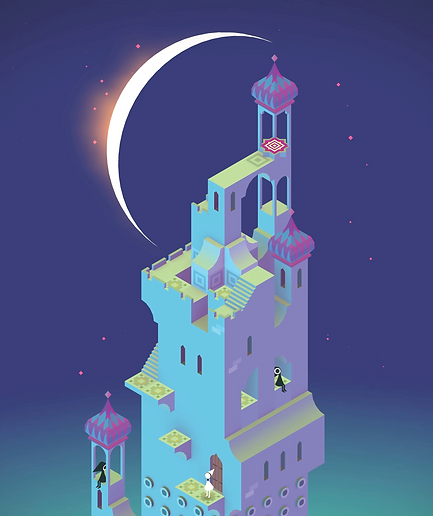
Monument Valley is a game known for it's effective use of color and perspective to create a sense of 3D space and depth. It manages to simultaneously be flat and isometric while feeling like a tangible thing.
This sort of approach immediately struck me as a great way to add visual interest to the playing cards.